The brief
Auxilo lends to students for higher education. They were building out a new product suite, and we came in as principal design, working through a product partner, to define the UX and set the design direction across three products at once. The interesting part was that the three did not share a job to be done. One is a high-stakes financial application. One is a way to find money you do not have to pay back. One is not a transaction at all, it is help finding your way. The task was to make all three feel like one company.
Three products, one foundation
Before designing any single screen, the decision that shaped everything was to treat the three as a system, not three separate projects. A student who takes a loan is often the same student looking for a scholarship and the same student moving to a new country. If each product looked and behaved like it came from a different company, that one person would feel it as three disconnected experiences at the most stressful moment of their life. So the shared foundation, the components, the language, the way a form asks for something, came first.
The loan engine: making a scary application finishable
An education loan for studying abroad is one of the most intimidating forms a family ever fills out. It is long, document-heavy, regulated, and it involves two anxious people at once: the student and a co-applicant sponsoring them. That anxiety is exactly where people abandon it, so the core of the work was designing the fear out of the flow.
Set expectations before the form starts. A short primer, and an upfront Documents Needed checklist split into what the student needs (PAN, Aadhaar, passport, test scores, admission letter) and what the sponsor needs (PAN, Aadhaar, bank statement, employment). You are never ambushed mid-form by a document you do not have.
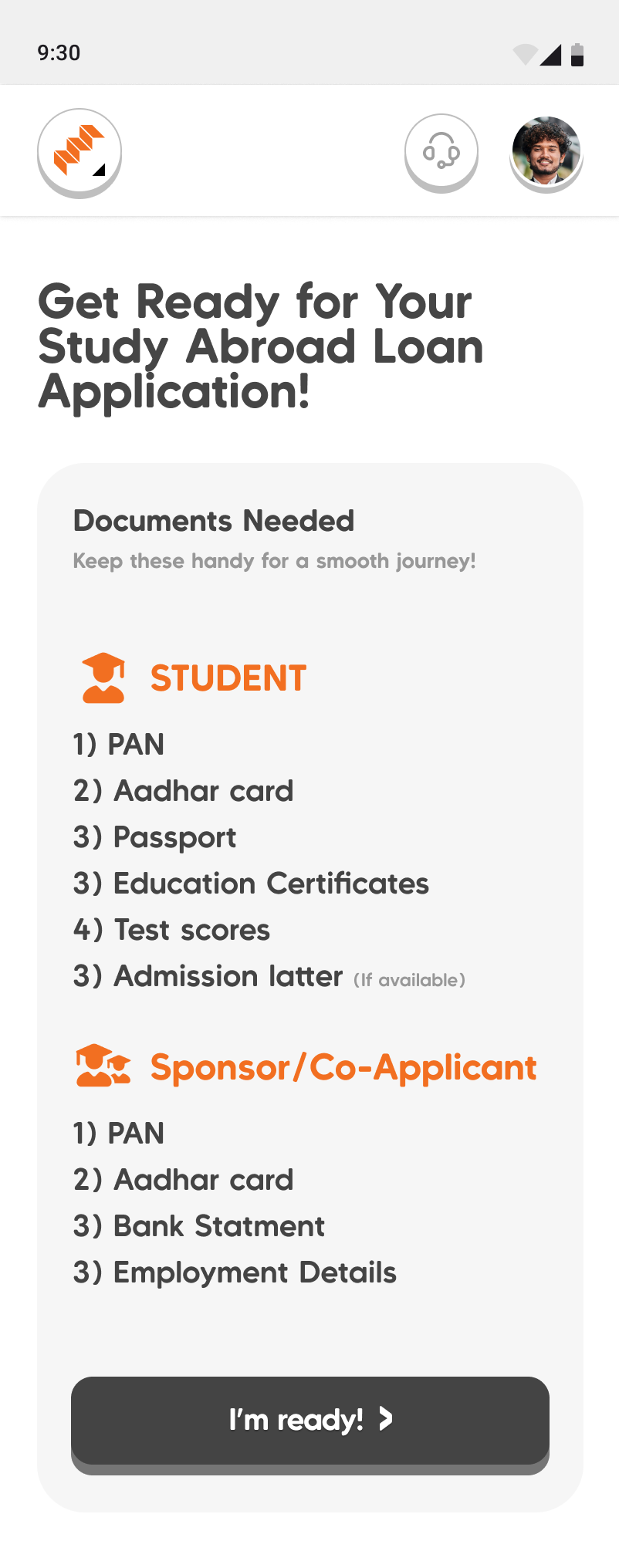
Never show the whole mountain. The application is broken into named steps that unlock one at a time, with a plain “Step 4 of 8” so you always know how much is left, instead of one endless scroll. Under that calm path sits real machinery: a full co-applicant sub-flow, KYC through Digilocker, a consent OTP, study-abroad profiling, and references, all made to feel like a guided journey, not a compliance gauntlet.
Confidence, at the moment of doubt
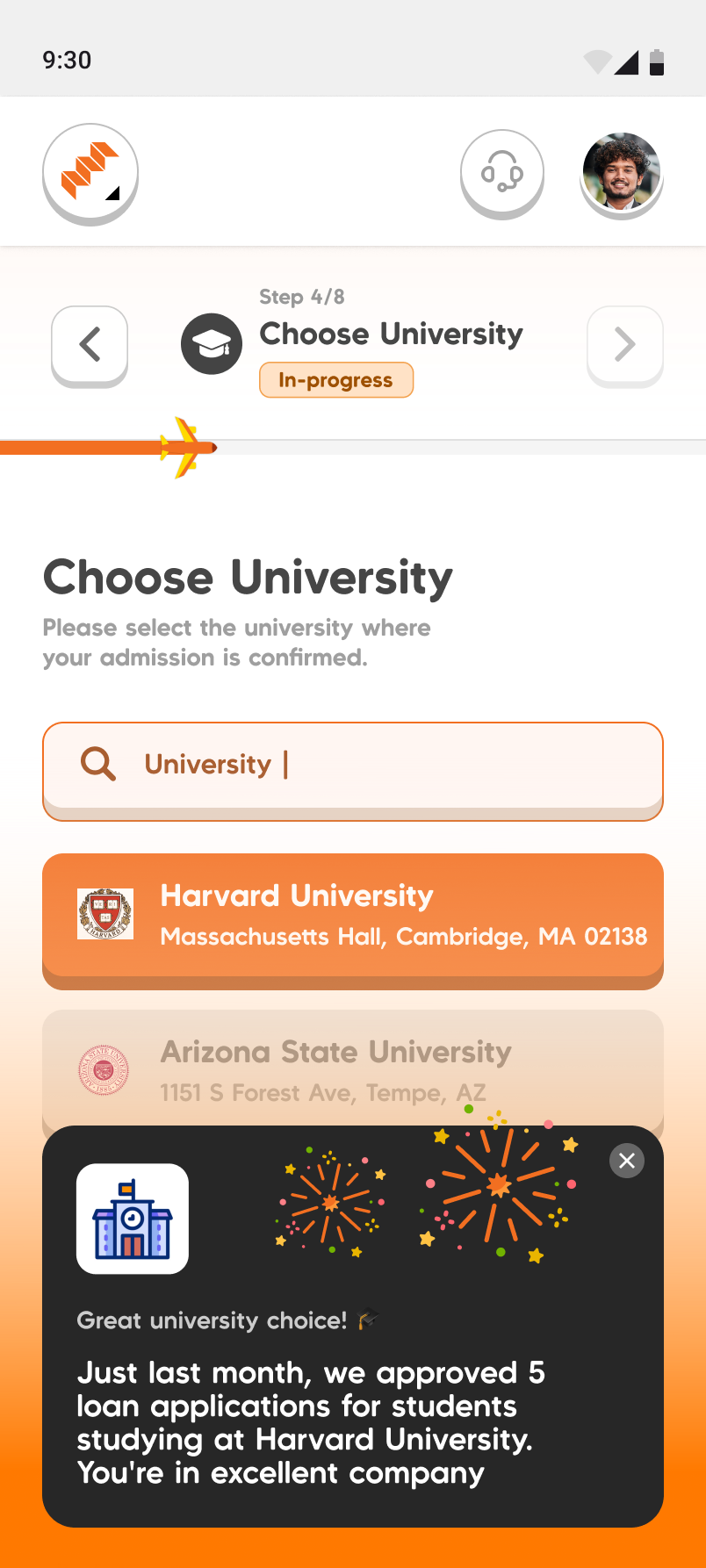
The detail we are most proud of is a small, recurring pattern: confidence-builder nudges. A loan application is emotional, and doubt creeps in at specific moments, usually right after you commit to a real choice. So the product answers those moments with contextual reassurance instead of leaving you alone with the hesitation.
ImpactX: giving money away, fairly
The second product, ImpactX, is the loan engine’s mirror image. Instead of lending money that gets repaid, it gives away a limited pool of scholarship money, and the entire design problem is fairness: how do you split a fixed amount across far more deserving students than it can cover, transparently, without it coming down to who applied first or who an administrator happened to favour?
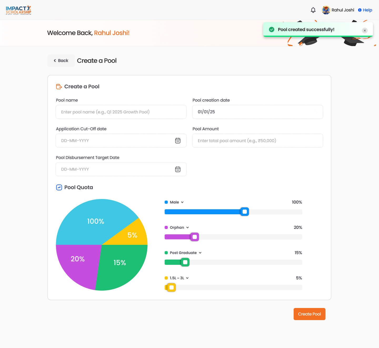
Fairness built into the container. An administrator creates a funding pool with a total amount and a cut-off date, then allocates it across need categories (income band, orphan status, education level) as quota percentages. The fairness is designed in before a single application is scored.
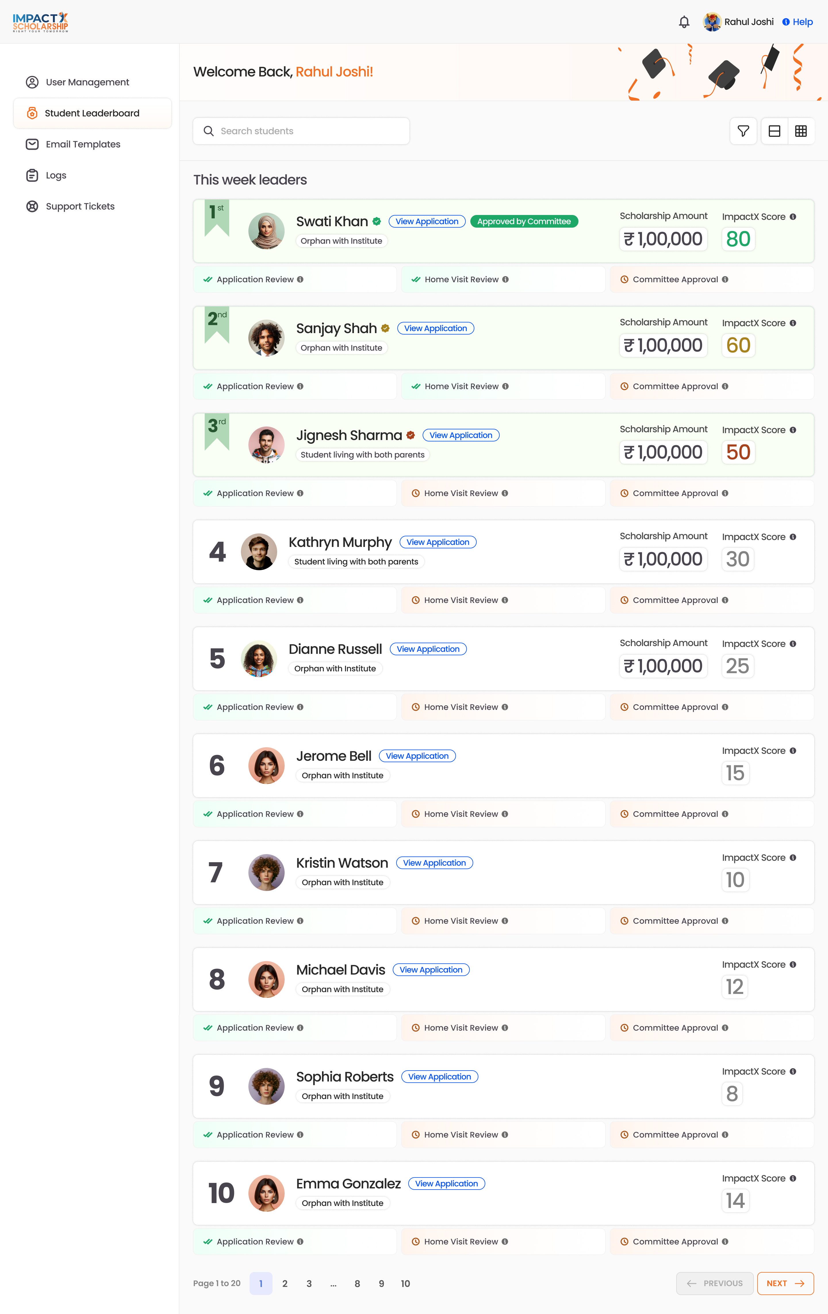
A score cannot see a home. So the review pipeline pairs the ranking with human verification: application review, then home visit, then committee approval, the decision informed by the number but never replaced by it.
The student network: guidance, human and machine
The third product, The Indian Student (TIS), is for the student who has decided to study abroad and has no idea how to actually get there. Its job is not a transaction, it issupport, designed around two kinds of guidance sitting side by side.
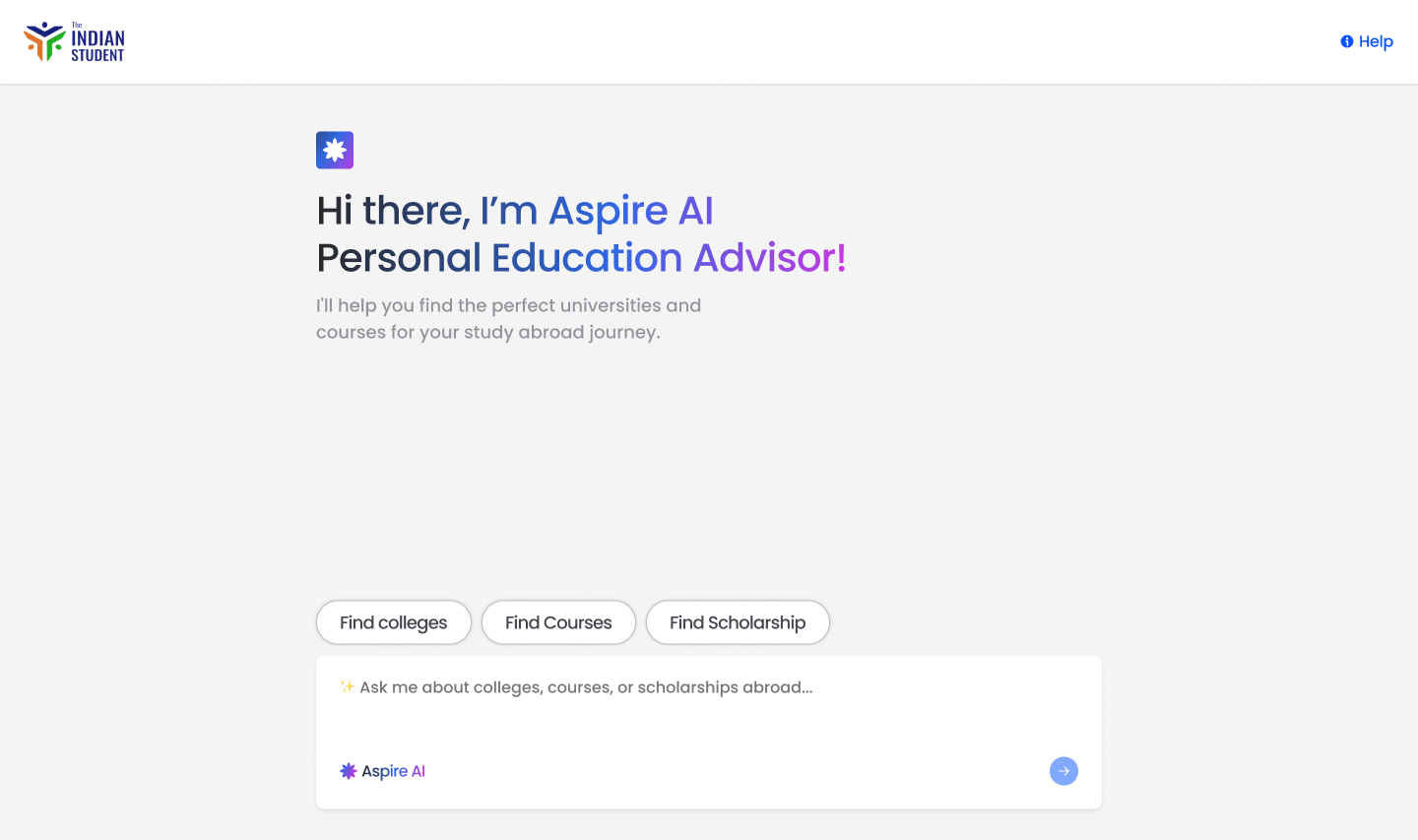
Aspire AI, a personal education advisor. Rather than drop an anxious student in front of a blank chat box (which just moves the burden of knowing what to ask onto them), the advisor guides the conversation with structured choices, academic level, field, where you want to study, online or on campus, and returns real course and college recommendations. An AI assistant designed so a student who does not yet know the questions can still get useful answers.
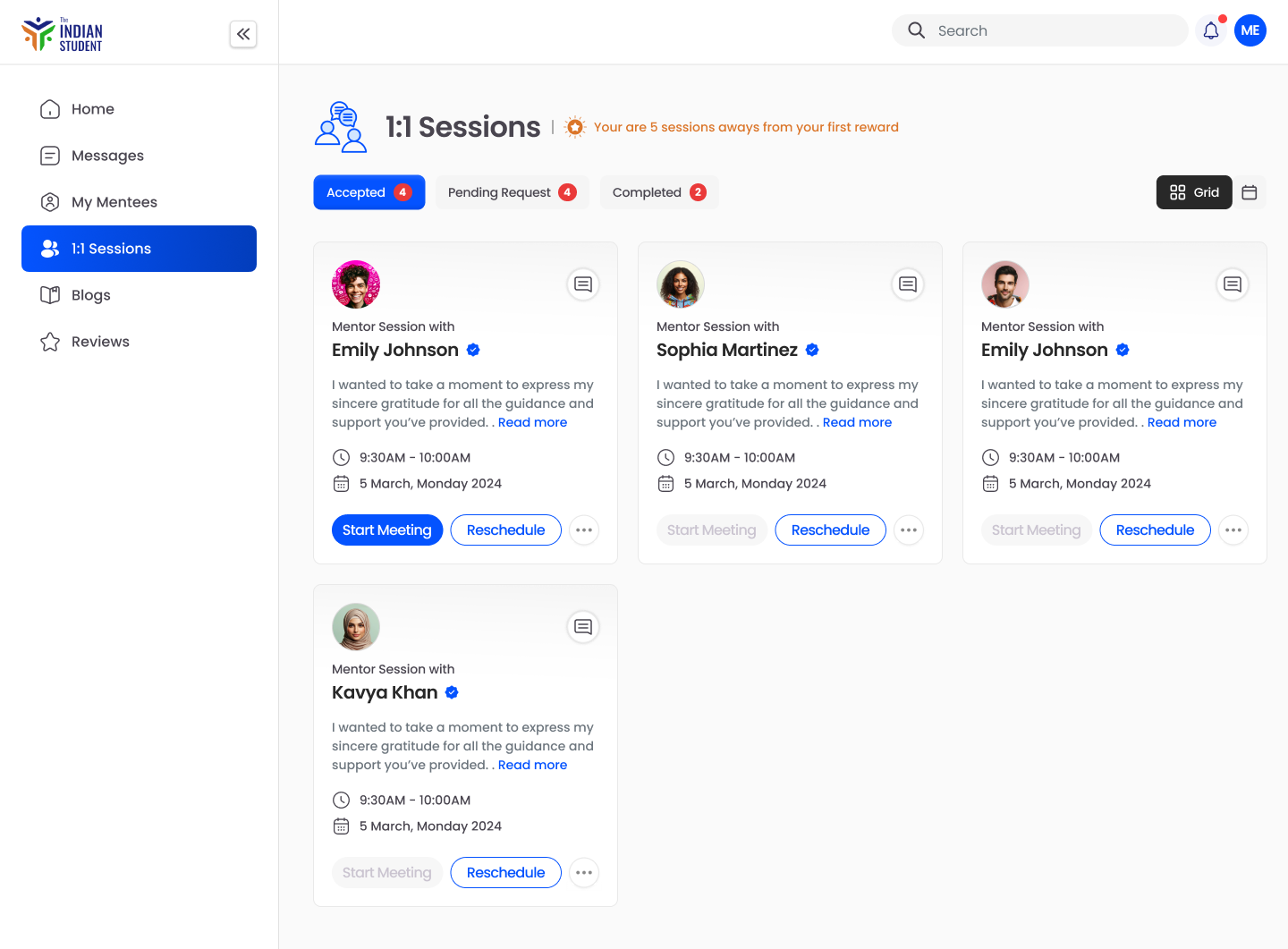
Real mentors, one to one. Alongside the AI, students book 1:1 sessions with mentors, message them, and leave reviews, while mentors run their own sessions and events. The machine narrows the field; a human who has already done it walks you the rest of the way.
The result
The through-line of this engagement was range without incoherence: a high-stakes loan application, a fairness-driven system for giving scholarships away, and a community space, held together so one student experiences one company. Setting a foundation the rest of the suite could be built on is what let a small team ship three products in parallel without drifting into three different apps.