The brief
A national insurance regulator wanted its citizen-facing website rebuilt. The work came in through ValueMomentum, the insurance-technology company that held the engagement, and ran across 2021 into 2022. The same engagement also covered the regulator’s internal employee intranet, but this study is about the public side, which is the harder and more interesting design problem.
The site’s job is unglamorous and enormous at once. It is where an ordinary person goes to find out what an insurer is allowed to do, what a policy actually covers, and how to complain when something goes wrong. Getting that right for a whole country is a very different task from designing for a niche of motivated users.
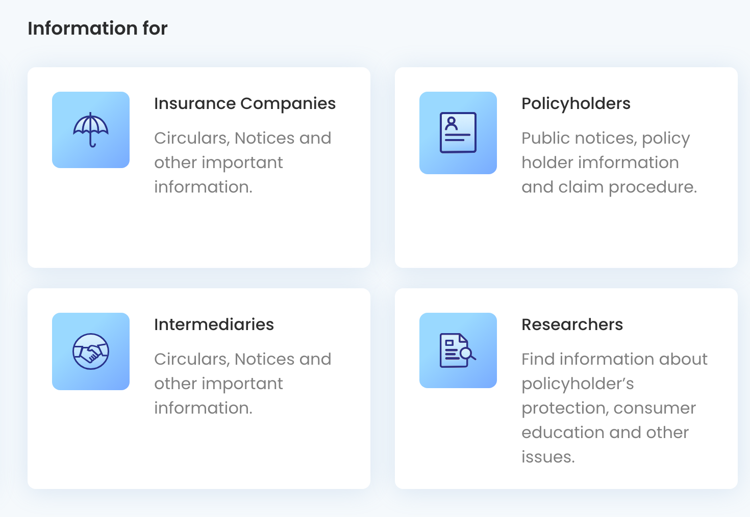
The hardest audience in the country
Most products get to choose their user. This one did not. The real constraint that shaped every decision was the breadth of the audience: around 200,000 people a month, from insurance professionals to first-time internet users opening the site on a cheap phone with a shaky connection, many of them not reading in English.
So two requirements were not features, they were the ground the whole design stood on. WCAG 2.1 AA accessibility, because a regulator’s public information has to be usable by people with low vision, screen readers, and motor limitations, not as a nicety but as a duty. And English plus twelve regional languages, because “national” in India means the same page has to work in scripts and sentence lengths that behave nothing alike. Designing for the least-forgiving user, not the average one, was the job.
A regulator speaks in PDFs
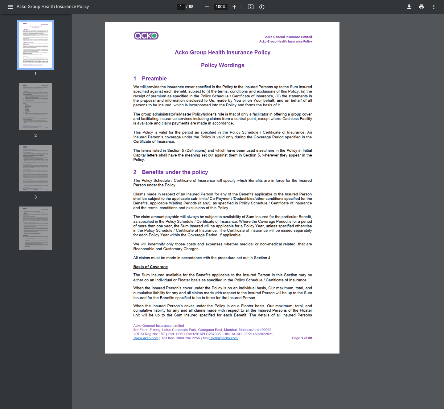
The insight that unlocked the whole project was noticing what the content actually is. A regulator does not publish articles. It publishes circulars, handbooks, notices, and orders, and almost all of it lives as PDFs. The old pattern was a wall of download links, and that quietly failed the exact people the site exists for: a download eats data, often opens in a broken viewer on a low-end phone, and drops someone out of the site entirely to hunt through their files.
The central design move was an inline PDF viewer, so a citizen reads the regulation where they found it, instead of being sent away to open it and lose the thread.
Around it we designed a small family of content templates for how a page carries its documents: content with attached files, content with links out, an inline viewer on its own, and inline viewers paired with either downloadable files or related links.
A content system a government team could run
A regulator’s website is not shipped once and left alone. Its content changes constantly, and it is maintained by staff, not designers. If every new page needed a designer, the site would drift into inconsistency within months and quietly break its own accessibility along the way.
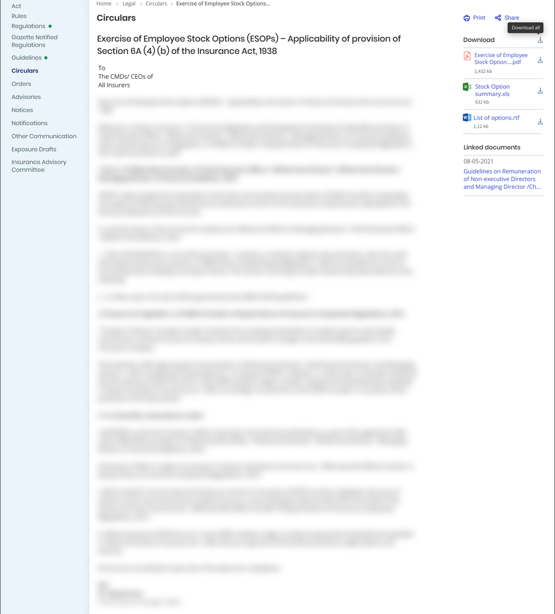
So we designed the public side as a system of content-page templates rather than a set of bespoke screens: consistent layouts for text with documents, text with links, full-width images, and inline images, each already carrying the accessibility and language behaviour underneath. A content team could publish a new page by choosing the right template and filling it in, and it would come out legible, accessible, and on-brand without anyone having to think about it.
Legibility as the whole job
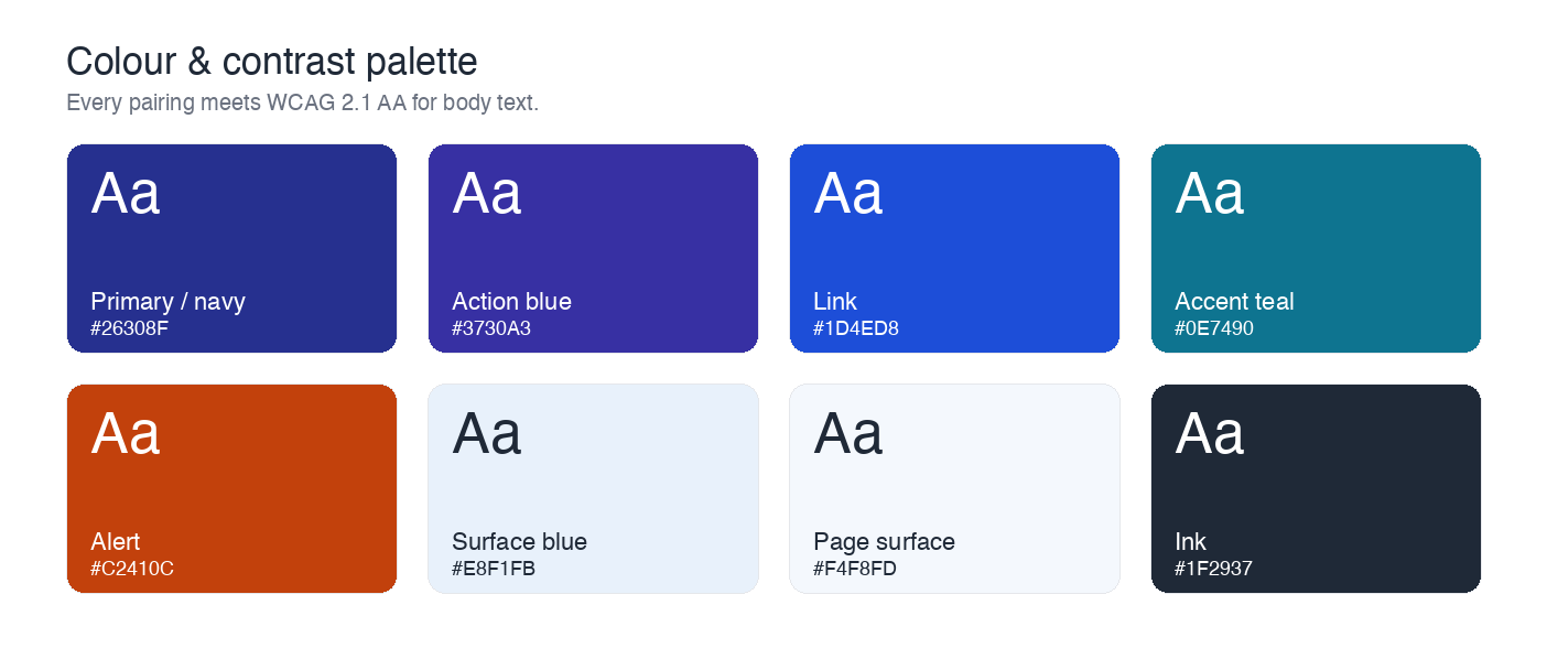
When your audience is everyone, visual craft stops being decoration and becomes access. A lot of the work was the quiet kind: a colour and contrast system tuned so text stayed readable for low-vision users and held up on bad screens in bright sun, type sized for comfort over density, and a structure that stayed calm even when a page was dense with legal content. The same discipline carried the multilingual requirement, a layout that only looks right in English is not really multilingual, so the system had to hold together when a heading in one language ran twice as long as in another.
The result
The lesson that stuck from this one is that the widest audience is the strictest brief. There was no clever interaction to hide behind and no target user to optimise for at everyone else’s expense. The measure of success was whether a first-time internet user, in their own language, on a phone that cost very little, could read a piece of regulation and understand their rights. Everything good in the design was in service of that, and none of it was meant to be noticed. We led the design and ran a small team to hit a regulator’s bar, delivering into ValueMomentum’s process and client relationship.