
Other Case Studies
UI Design
Ux Design
Brand Design
An affordable & scalable parcel delivery platform — UX Case study

About the Project
The on-demand parcel delivery industry is stuck with the same system of delivering parcels. This model required a delivery company to hire a massive fleet of delivery personnel who would pick up and drop packages. This system required an enormous upfront investment, which would cause the costs to deliver each package to increase.
Dropdart came with a solution, where they would get everyday people to deliver the parcels on their way to work or wherever they were going. They also wanted this whole process to be as quick and straightforward as possible to make it convenient for people to request delivery as well as the people performing a delivery.
Duration
2 Months
Industry
Delivery
Role
UI/UX Design
Branding Design
Tools
Figma
Discovery
For our research, we looked into the existing system in other industries taking into reference other on-demand service applications to see how they handled this particular issue, spoke to the stakeholders, identified potential customers and interviewed them.
We also looked into government regulations and requirements to provide a service like this.
Define
After the research, some of the main issues with the solution involved trust. Most people would not trust giving their parcel to be delivered by a random stranger, which was one of the biggest challenges we had to solve while building the system.
To solve this problem, we built the whole system around trust — where we would vet each person who would request to make the delivery and keep customers in a constant loop so they would know exactly where the package is at all times. We also gave the customers an option to pay the extra cost for a premium service where an employee of the company itself would make the delivery for them in case it is a treasured item.
We help to get improving their branding, creating websites, and making graphic designs. We help to get improving their branding, creating websites, and making graphic designs.
Design
Since the main issue, we saw during our research was trust, we decided to use green
to represent stability and consistency in the brand to build that.
For the rest of the visual design, we used much white as well to emphasize the
information on the screen and not distract them from their primary function.
Parcel Size
In order to make the process flawless, user have to choose the size of the package which would connect them to a delivery person who has a vehicle which can transport the package.


7926 Halvorson Route
7926 Halvorson Route
Confirm
Packaging Size
Choose size of the package


Small
Medium
Large
X Large
Huge
8:00am - 8:20am
Rs 200
965 Miller Square
59 Renner Manor Suite 325
8:00am - 8:20am
Rs 200
965 Miller Square
59 Renner Manor Suite 325
8:00am - 8:20am
Rs 200
965 Miller Square
59 Renner Manor Suite 325
8:00am - 8:20am
Rs 200
965 Miller Square
59 Renner Manor Suite 325
Pickup History
Today
Yesterday
Order Tracking
and management
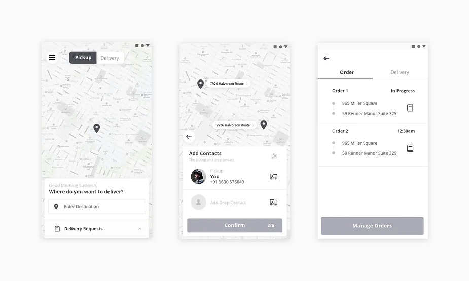
To gain the trust of the user, we made
available as much information as
possible about the packages which are being delivered - and a system to track if there are multiple orders placed by the customer.
OTP Confirmation
for both sides
Additional security, at different stages of the delivery both the delivery person and the person who will receive the delivery will have to share an OTP to input in their phone.

Enter OTP
You have arrived
Henry Collier
798 Virgie Mission
Directions


Other Case Studies

Other Case Studies
UI Design
Ux Design
Brand Design
An affordable & scalable parcel delivery platform — UX Case study

About the Project
The on-demand parcel delivery industry is stuck with the same system of delivering parcels. This model required a delivery company to hire a massive fleet of delivery personnel who would pick up and drop packages. This system required an enormous upfront investment, which would cause the costs to deliver each package to increase.
Dropdart came with a solution, where they would get everyday people to deliver the parcels on their way to work or wherever they were going. They also wanted this whole process to be as quick and straightforward as possible to make it convenient for people to request delivery as well as the people performing a delivery.
Duration
2 Months
Industry
Delivery
Role
UI/UX Design
Branding Design
Tools
Figma
Discovery
For our research, we looked into the existing system in other industries taking into reference other on-demand service applications to see how they handled this particular issue, spoke to the stakeholders, identified potential customers and interviewed them.
We also looked into government regulations and requirements to provide a service like this.
Define
After the research, some of the main issues with the solution involved trust. Most people would not trust giving their parcel to be delivered by a random stranger, which was one of the biggest challenges we had to solve while building the system.
To solve this problem, we built the whole system around trust — where we would vet each person who would request to make the delivery and keep customers in a constant loop so they would know exactly where the package is at all times. We also gave the customers an option to pay the extra cost for a premium service where an employee of the company itself would make the delivery for them in case it is a treasured item.

Design
Since the main issue, we saw during our research was trust, we decided to use green
to represent stability and consistency in the brand to build that.
For the rest of the visual design, we used much white as well to emphasize the
information on the screen and not distract them from their primary function.
Parcel Size
In order to make the process flawless, user have to choose the size of the package which would connect them to a delivery person who has a vehicle which can transport the package.


7926 Halvorson Route
7926 Halvorson Route
Confirm
Packaging Size
Choose size of the package


Small
Medium
Large
X Large
Huge
8:00am - 8:20am
Rs 200
965 Miller Square
59 Renner Manor Suite 325
8:00am - 8:20am
Rs 200
965 Miller Square
59 Renner Manor Suite 325
8:00am - 8:20am
Rs 200
965 Miller Square
59 Renner Manor Suite 325
8:00am - 8:20am
Rs 200
965 Miller Square
59 Renner Manor Suite 325
Pickup History
Today
Yesterday
Order Tracking and management
To gain the trust of the user, we made available as much information as possible about the packages which are being delivered - and a system to track if there are multiple orders placed by the customer.
OTP Confirmation for both sides
Additional security, at different stages of the delivery both the delivery person and the person who will receive the delivery will have to share an OTP to input in their phone.

Enter OTP
You have arrived
Henry Collier
798 Virgie Mission
Directions


Other Case Studies

Other Case Studies
UI Design
Ux Design
Brand Design
An affordable & scalable parcel delivery platform — UX Case study

About the Project
The on-demand parcel delivery industry is stuck with the same system of delivering parcels. This model required a delivery company to hire a massive fleet of delivery personnel who would pick up and drop packages. This system required an enormous upfront investment, which would cause the costs to deliver each package to increase.
Dropdart came with a solution, where they would get everyday people to deliver the parcels on their way to work or wherever they were going. They also wanted this whole process to be as quick and straightforward as possible to make it convenient for people to request delivery as well as the people performing a delivery.
Duration
2 Months
Industry
Delivery
Role
UI/UX Design
Branding Design
Tools
Figma
Discovery
For our research, we looked into the existing system in other industries taking into reference other on-demand service applications to see how they handled this particular issue, spoke to the stakeholders, identified potential customers and interviewed them.
We also looked into government regulations and requirements to provide a service like this.
Define
After the research, some of the main issues with the solution involved trust. Most people would not trust giving their parcel to be delivered by a random stranger, which was one of the biggest challenges we had to solve while building the system.
To solve this problem, we built the whole system around trust — where we would vet each person who would request to make the delivery and keep customers in a constant loop so they would know exactly where the package is at all times. We also gave the customers an option to pay the extra cost for a premium service where an employee of the company itself would make the delivery for them in case it is a treasured item.
After the research, some of the main issues with the solution involved trust. Most people would not trust giving their parcel to be delivered by a random stranger, which was one of the biggest challenges we had to solve while building the system.
To solve this problem, we built the whole system around trust — where we would vet each person who would request to make the delivery and keep customers in a constant loop so they would know exactly where the package is at all times. We also gave the customers an option to pay the extra cost for a premium service where an employee of the company itself would make the delivery for them in case it is a treasured item.

Design
Since the main issue, we saw during our research was trust, we decided to use green to represent stability and consistency in the brand to build that.
For the rest of the visual design, we used much white as well to emphasize the information on the screen and not distract them from their primary function.
Parcel Size
In order to make the process flawless, user have to choose the size of the package which would connect them to a delivery person who has a vehicle which can transport the package.


7926 Halvorson Route
7926 Halvorson Route
Confirm
Packaging Size
Choose size of the package


Small
Medium
Large
X Large
Huge
8:00am - 8:20am
Rs 200
965 Miller Square
59 Renner Manor Suite 325
8:00am - 8:20am
Rs 200
965 Miller Square
59 Renner Manor Suite 325
8:00am - 8:20am
Rs 200
965 Miller Square
59 Renner Manor Suite 325
8:00am - 8:20am
Rs 200
965 Miller Square
59 Renner Manor Suite 325
Pickup History
Today
Yesterday
Order Tracking and management
To gain the trust of the user, we made available as much information as possible about the packages which are being delivered - and a system to track if there are multiple orders placed by the customer.
OTP Confirmation
for both sides
Additional security, at different stages of the delivery both the delivery person and the person who will receive the delivery will have to share an OTP to input in their phone.

Enter OTP
You have arrived
Henry Collier
798 Virgie Mission
Directions


Other Case Studies

Other Case Studies
UI Design
Ux Design
Brand Design
An affordable & scalable parcel delivery platform — UX Case study

About the Project
The on-demand parcel delivery industry is stuck with the same system of delivering parcels. This model required a delivery company to hire a massive fleet of delivery personnel who would pick up and drop packages. This system required an enormous upfront investment, which would cause the costs to deliver each package to increase.
Dropdart came with a solution, where they would get everyday people to deliver the parcels on their way to work or wherever they were going. They also wanted this whole process to be as quick and straightforward as possible to make it convenient for people to request delivery as well as the people performing a delivery.
Duration
2 Months
Industry
Delivery
Role
UI/UX Design
Branding Design
Tools
Figma
Discovery
For our research, we looked into the existing system in other industries taking into reference other on-demand service applications to see how they handled this particular issue, spoke to the stakeholders, identified potential customers and interviewed them.
We also looked into government regulations and requirements to provide a service like this.
Define
After the research, some of the main issues with the solution involved trust. Most people would not trust giving their parcel to be delivered by a random stranger, which was one of the biggest challenges we had to solve while building the system.
To solve this problem, we built the whole system around trust — where we would vet each person who would request to make the delivery and keep customers in a constant loop so they would know exactly where the package is at all times. We also gave the customers an option to pay the extra cost for a premium service where an employee of the company itself would make the delivery for them in case it is a treasured item.
After the research, some of the main issues with the solution involved trust. Most people would not trust giving their parcel to be delivered by a random stranger, which was one of the biggest challenges we had to solve while building the system.
To solve this problem, we built the whole system around trust — where we would vet each person who would request to make the delivery and keep customers in a constant loop so they would know exactly where the package is at all times. We also gave the customers an option to pay the extra cost for a premium service where an employee of the company itself would make the delivery for them in case it is a treasured item.

Design
Since the main issue, we saw during our research was trust, we decided to use green
to represent stability and consistency in the brand to build that.
For the rest of the visual design, we used much white as well to emphasize the
information on the screen and not distract them from their primary function.
Parcel Size
In order to make the process flawless, user have to choose the size of the package which would connect them to a delivery person who has a vehicle which can transport the package.


7926 Halvorson Route
7926 Halvorson Route
Confirm
Packaging Size
Choose size of the package


Small
Medium
Large
X Large
Huge
8:00am - 8:20am
Rs 200
965 Miller Square
59 Renner Manor Suite 325
8:00am - 8:20am
Rs 200
965 Miller Square
59 Renner Manor Suite 325
8:00am - 8:20am
Rs 200
965 Miller Square
59 Renner Manor Suite 325
8:00am - 8:20am
Rs 200
965 Miller Square
59 Renner Manor Suite 325
Pickup History
Today
Yesterday
Order Tracking
and management
To gain the trust of the user, we made available as much information as possible about the packages which are being delivered - and a system to track if there are multiple orders placed by the customer.
OTP Confirmation
for both sides
Additional security, at different stages of the delivery both the delivery person and the person who will receive the delivery will have to share an OTP to input in their phone.

Enter OTP
You have arrived
Henry Collier
798 Virgie Mission
Directions


Other Case Studies

Other Case Studies
UI Design
Ux Design
Brand Design
An affordable & scalable parcel delivery platform — UX Case study

About the Project
The on-demand parcel delivery industry is stuck with the same system of delivering parcels. This model required a delivery company to hire a massive fleet of delivery personnel who would pick up and drop packages. This system required an enormous upfront investment, which would cause the costs to deliver each package to increase.
Dropdart came with a solution, where they would get everyday people to deliver the parcels on their way to work or wherever they were going. They also wanted this whole process to be as quick and straightforward as possible to make it convenient for people to request delivery as well as the people performing a delivery.
Duration
2 Months
Industry
Delivery
Role
UI/UX Design
Branding Design
Tools
Figma
Discovery
For our research, we looked into the existing system in other industries taking into reference other on-demand service applications to see how they handled this particular issue, spoke to the stakeholders, identified potential customers and interviewed them.
We also looked into government regulations and requirements to provide a service like this.
Define
After the research, some of the main issues with the solution involved trust. Most people would not trust giving their parcel to be delivered by a random stranger, which was one of the biggest challenges we had to solve while building the system.
To solve this problem, we built the whole system around trust — where we would vet each person who would request to make the delivery and keep customers in a constant loop so they would know exactly where the package is at all times. We also gave the customers an option to pay the extra cost for a premium service where an employee of the company itself would make the delivery for them in case it is a treasured item.
After the research, some of the main issues with the solution involved trust. Most people would not trust giving their parcel to be delivered by a random stranger, which was one of the biggest challenges we had to solve while building the system.
To solve this problem, we built the whole system around trust — where we would vet each person who would request to make the delivery and keep customers in a constant loop so they would know exactly where the package is at all times. We also gave the customers an option to pay the extra cost for a premium service where an employee of the company itself would make the delivery for them in case it is a treasured item.

Design
Since the main issue, we saw during our research was trust, we decided to use green
to represent stability and consistency in the brand to build that.
For the rest of the visual design, we used much white as well to emphasize the
information on the screen and not distract them from their primary function.
Parcel Size
In order to make the process flawless, user have to choose the size of the package which would connect them to a delivery person who has a vehicle which can transport the package.


7926 Halvorson Route
7926 Halvorson Route
Confirm
Packaging Size
Choose size of the package


Small
Medium
Large
X Large
Huge
8:00am - 8:20am
Rs 200
965 Miller Square
59 Renner Manor Suite 325
8:00am - 8:20am
Rs 200
965 Miller Square
59 Renner Manor Suite 325
8:00am - 8:20am
Rs 200
965 Miller Square
59 Renner Manor Suite 325
8:00am - 8:20am
Rs 200
965 Miller Square
59 Renner Manor Suite 325
Pickup History
Today
Yesterday
Order Tracking
and management
To gain the trust of the user, we made
available as much information as
possible about the packages which are being delivered - and a system to track if there are multiple orders placed by the customer.
OTP Confirmation
for both sides
Additional security, at different stages of the delivery both the delivery person and the person who will receive the delivery will have to share an OTP to input in their phone.

Enter OTP
You have arrived
Henry Collier
798 Virgie Mission
Directions


