Landing page inspiration for your next website
Landing page inspiration for your next website
Landing page inspiration for your next website
Sunny Haladker
Co-founder
Co-founder
5 Min ago
5 Min ago
15 Mar 2022
15 Mar 2022
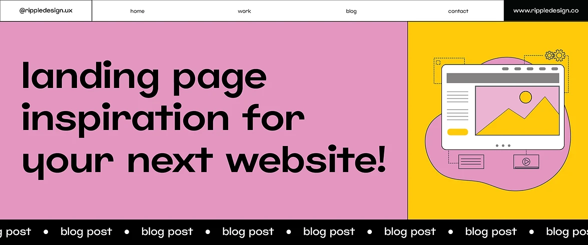


Just like a human face, the front page of a website is central to interaction or, rather, user interaction here. In the tech world, a website’s front page leaves the first impression that may become the last impression. It portrays brand values and expresses brand voice within milliseconds. During these crucial milliseconds, most users decide whether they want to stay or leave the website.
Yes, this is why businesses spend a great deal of money on developing a custom website design, ditching the default themes of a CMS. Custom web design offers business owners full control over their website, where they can tweak user experience as per their requirements.
As they try to retain users, most websites optimise the user experience by keeping the front page simple and decluttered instead of filling it with aggressive colour schemes and graphics. A clear UX enhances easy navigation, ultimately leading to meeting user expectations.
With the rising competition and struggle for user experience, choosing the right front page design has become challenging. However, the below-given options are some of the best home page designs you can trust.
Hamburger Menu
Though this is a traditional horizontal menu design, it remains a classic among the best front page designs. Tweaking this traditional style, UX designers now use a new way of implementing this design where an icon is used to open a sliding side menu or a navigation drawer. Usually, there are three bars that, when clicked by the user, drop the menu. It takes the form of a sandwich, making the overall design look like a hamburger.
Research shows that the human eye accustoms to different shapes easily. It’s the key reason why the hamburger menu is a widely acclaimed front page design. The style is embraced by popular websites and apps such as Google maps, Uber, Bootstrap, Adidas, and more.
Card Style Layouts
Popularised by Pinterest, Facebook, Dribbble, and more, card style is one of the most standard designs for websites and blogs. They’re perfect for websites containing a lot of content as they arrange each piece without compromising its distinctiveness.
The layout comes with boxes or blocks resembling physical cards. These blocks can be of various shapes and sizes. Usually, there are two famous card web layouts, one presenting the cards on a grid with equal dimensions, and the other has a fluid grid with different card sizes placed in the order of the columns but without specific rows.
The neat synchronization of a card web design leaves a soothing impression. Identical to physical cards, it also seems familiar to us. Typically, designers pick this style when the website has to display a large amount of content but in an arranged manner. You can check out LinkedIn, Pinterest, or even streaming platforms like Netflix to understand the suitability of this design according to the subject matter.
Split Screen
Yet again, this front-page design is a classic one. Split screens picked up popularity back in 2013 and haven't stopped till now. Why they’re famous? The layout perfectly settles the weight of two elements, typically text and image, where both need an equal representation. Sometimes text is overlaid, or two images are placed together; it is said to be a conscious design choice that leads to a minimalist and sophisticated appeal.
Though most split-screen home pages are even, sometimes different ratios could be seen. Nowadays, 33:66 or 40:60 are the most trendy ratios where the screen is split into smaller sizes. Most e-commerce websites use this front-page design where the prominence of products and other features like ‘add to cart’ or ‘buy now’ is highlighted. Check out the website of Studio Meta and Bose to understand the implementation of split screen.
Magazine Style Design
Evidently, periodical industries and news are the key causes behind the rise of magazine-style website layouts. This design was only seen in magazines or news websites a few years back. When the style gained popularity, other domains such as e-commerce and content blog websites also started adopting the design.
Mainly, magazine layouts include featuring one or multiple articles along with secondary or tertiary articles on the front page. In addition, the layout consists of columns that sometimes bifurcate different sections of the website. If you’re planning to create a website where large amounts of content have to be posted daily, this might be an appropriate selection. Check out Wired and Azure's websites to get an idea about magazine-style website designs.
Asymmetry
Sometimes chaos can deliver peace. That’s what asymmetry in design depicts. Asymmetry rejects symmetry and leaves a dynamic and raw visual impact. Designers can create an asymmetrical front page design using images and texts without worrying about balance and proportion. It can be introduced in an already existing design by reinforcing the background elements or by using different patterns for particular sections.
The powerful visual impact created by an asymmetrical homepage design can effectively communicate brand voices. As it comprises unexpected and dynamic elements, it can be useful for marketing and practical designs. Check out the website of Studio Forum and Contrive to understand the application of asymmetrical home page design.
Hero Images
Since the buzz for immersive technologies is up in the air, similar experiences can be exciting. That’s exactly what hero images do! This front-page design idea emphasizes large sizes and enhances aesthetics along with showcasing in-depth content. Hero images are among the best homepage design ideas for e-commerce websites as they help boost customer persuasion and sales. You can use your stats, illustrations, and images of your top-selling products for the hero image homepage. You can go through Apple’s iPad page to explore the hero image webpage design application.
Start now!
It can be confusing to select the right front page layout for your website. So, to tone down the process, prepare a checklist considering primary factors such as user experience, compatibility with niche, brand/business goals, functionality, user navigation, psychological impacts, etc. Then, browse these classic home page website design ideas keeping your checklist handy. And voila! You’ll select the most suitable front-page website design in no time.


More Blogs
More Blogs
More Blogs
12 Aug 2024
•
5 Min ago
Testing in Design Thinking
The five stages of Design Thinking — Empathize, Define, Ideate, Prototype and Test — are not meant to be sequential steps to be taken as...
Sunny Haladker
12 Aug 2024
•
5 Min ago
10 types of prototypes
In the prototyping stage of design thinking, we try to explore the problem we have identified and ideated on. We create a sample to test...
Sunny Haladker
12 Aug 2024
•
5 Min ago
Design Thinking Phase 3 - Prototyping
Design thinking is a human centered, non linear iterative process that helps us understand our users or customers needs better, and...
Sunny Haladker


12 Aug 2024
•
5 Min ago
Testing in Design Thinking
The five stages of Design Thinking — Empathize, Define, Ideate, Prototype and Test — are not meant to be sequential steps to be taken as...
Sunny Haladker


12 Aug 2024
•
5 Min ago
10 types of prototypes
In the prototyping stage of design thinking, we try to explore the problem we have identified and ideated on. We create a sample to test...
Sunny Haladker


12 Aug 2024
•
5 Min ago
Design Thinking Phase 3 - Prototyping
Design thinking is a human centered, non linear iterative process that helps us understand our users or customers needs better, and...
Sunny Haladker


12 Aug 2024
•
5 Min ago
Testing in Design Thinking
Testing in Design Thinking
The five stages of Design Thinking — Empathize, Define, Ideate, Prototype and Test — are not meant to be sequential steps to be taken as...
Sunny Haladker


12 Aug 2024
•
5 Min ago
10 types of prototypes
10 types of prototypes
In the prototyping stage of design thinking, we try to explore the problem we have identified and ideated on. We create a sample to test...
Sunny Haladker


12 Aug 2024
•
5 Min ago
Design Thinking Phase 3 - Prototyping
Design Thinking Phase 3 - Prototyping
Design thinking is a human centered, non linear iterative process that helps us understand our users or customers needs better, and...
Sunny Haladker


12 Aug 2024
•
5 Min ago
Testing in Design Thinking
The five stages of Design Thinking — Empathize, Define, Ideate, Prototype and Test — are not meant to be sequential steps to be taken as...
Sunny Haladker


12 Aug 2024
•
5 Min ago
10 types of prototypes
In the prototyping stage of design thinking, we try to explore the problem we have identified and ideated on. We create a sample to test...
Sunny Haladker


12 Aug 2024
•
5 Min ago
Design Thinking Phase 3 - Prototyping
Design thinking is a human centered, non linear iterative process that helps us understand our users or customers needs better, and...
Sunny Haladker
More Blogs


12 Aug 2024
•
5 Min ago
Testing in Design Thinking
The five stages of Design Thinking — Empathize, Define, Ideate, Prototype and Test — are not meant to be sequential steps to be taken as...
Sunny Haladker


12 Aug 2024
•
5 Min ago
10 types of prototypes
In the prototyping stage of design thinking, we try to explore the problem we have identified and ideated on. We create a sample to test...
Sunny Haladker


12 Aug 2024
•
5 Min ago
Design Thinking Phase 3 - Prototyping
Design thinking is a human centered, non linear iterative process that helps us understand our users or customers needs better, and...
Sunny Haladker