6 Most Inspiring Art Moments For UX Design
6 Most Inspiring Art Moments For UX Design
6 Most Inspiring Art Moments For UX Design
Sunny Haladker
Co-founder
Co-founder
5 Min ago
5 Min ago
12 Jan 2022
12 Jan 2022
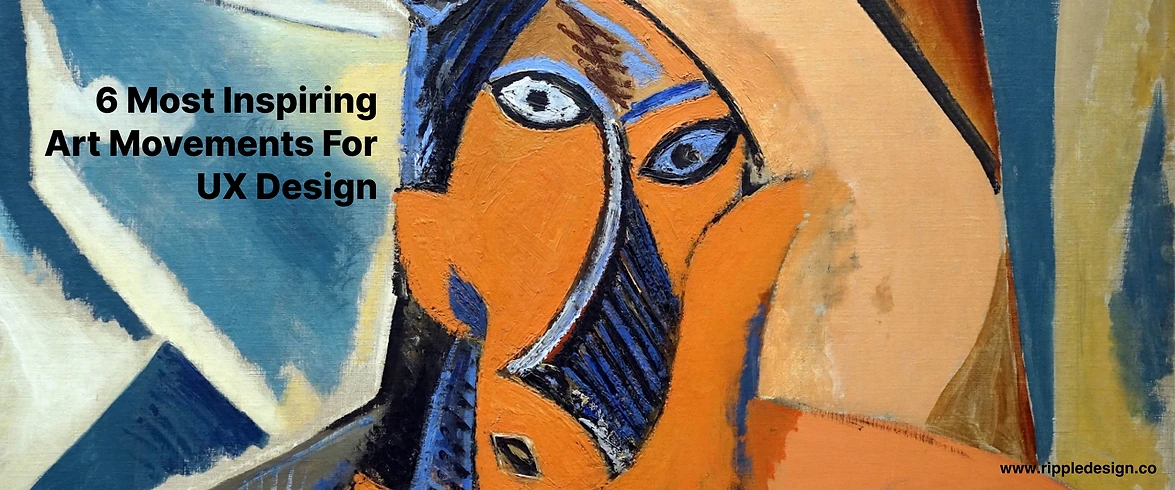


UX designers are probably familiar with various iconic art movements, including those we covered in our series of Isms of art- Tracing the Timeline of The Most Famous Movements of Art History. You must have observed how these art styles are intertwined with each other. In fact, every style movement became a basis of either a reaction or inspiration for its successive art genre. For designers, these art styles are not only the sources of inspiration but may become the foundation of their design or artwork that can leave an impression on future generations. The diverse art styles encourage your creative freedom, enabling you to experiment and discover your unique way of designing. So, without further ado, let's get some graphic boost and analyze some of the key styles that revolutionized modern design trends.
Art Nouveau
During the Art Nouveau movement, the glorification of beauty and sensuality came to force. Prominent examples include Czech graphic artist Alfons Mucha who was significantly influenced by the movement and created a beautiful art of women as goddesses surrounded by flowers and plants.
Key features of Art Nouveau include-
Ornamentalism
Smooth curvy lines
Pastel color palette
Natural motifs (plants, flowers, birds)
Sensuality
Femininity
How to use Art Nouveau principles for modern design-
The concept of sensuality ingrained in the Art Nouveau style is an excellent source of inspiration for UI and UX designers. Designers can effortlessly apply the features to products based on beauty, fragrance, cosmetics, clothing, etc., to infuse a graceful look in the interface. They can be playful with various delicate elements of the Art Nouveau style, such as pastel color palette, pattern drawing, enhancing women's beauty, fluid curvy lines, flora and fauna patterns, and much more.
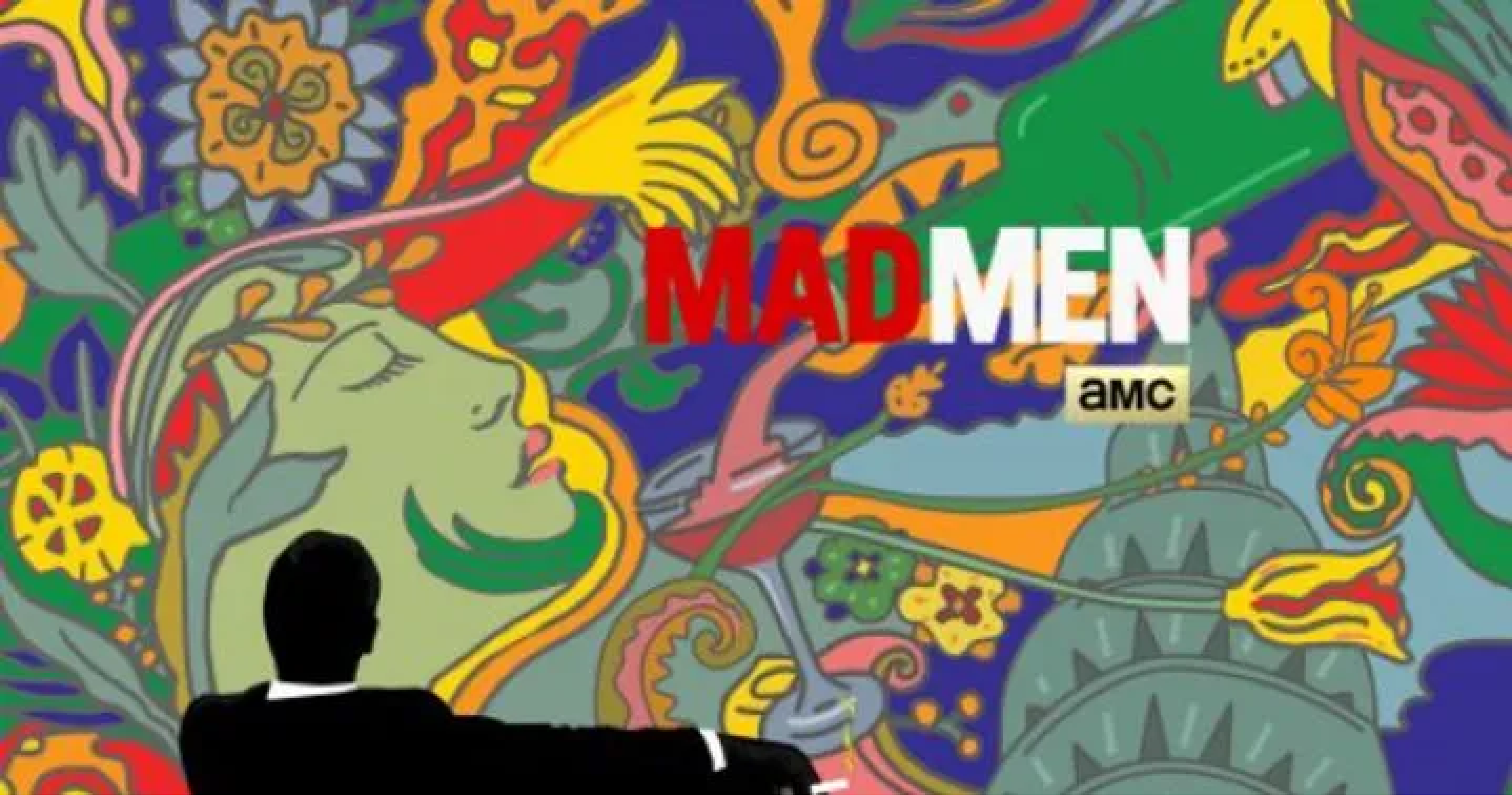
In the modern design, glimpses of Art Nouveau style can be seen in the works of visual communication industry artists, for example, the painting of Marilyn Monroe for “Visages De Renom” by Les Katz, a New York-based illustrator and the Mad man poster for AMC by Milton Glaser. The exquisite use of striking use of geometric shapes, floral patterns, and pastel colors is worth taking note of.
Bauhaus
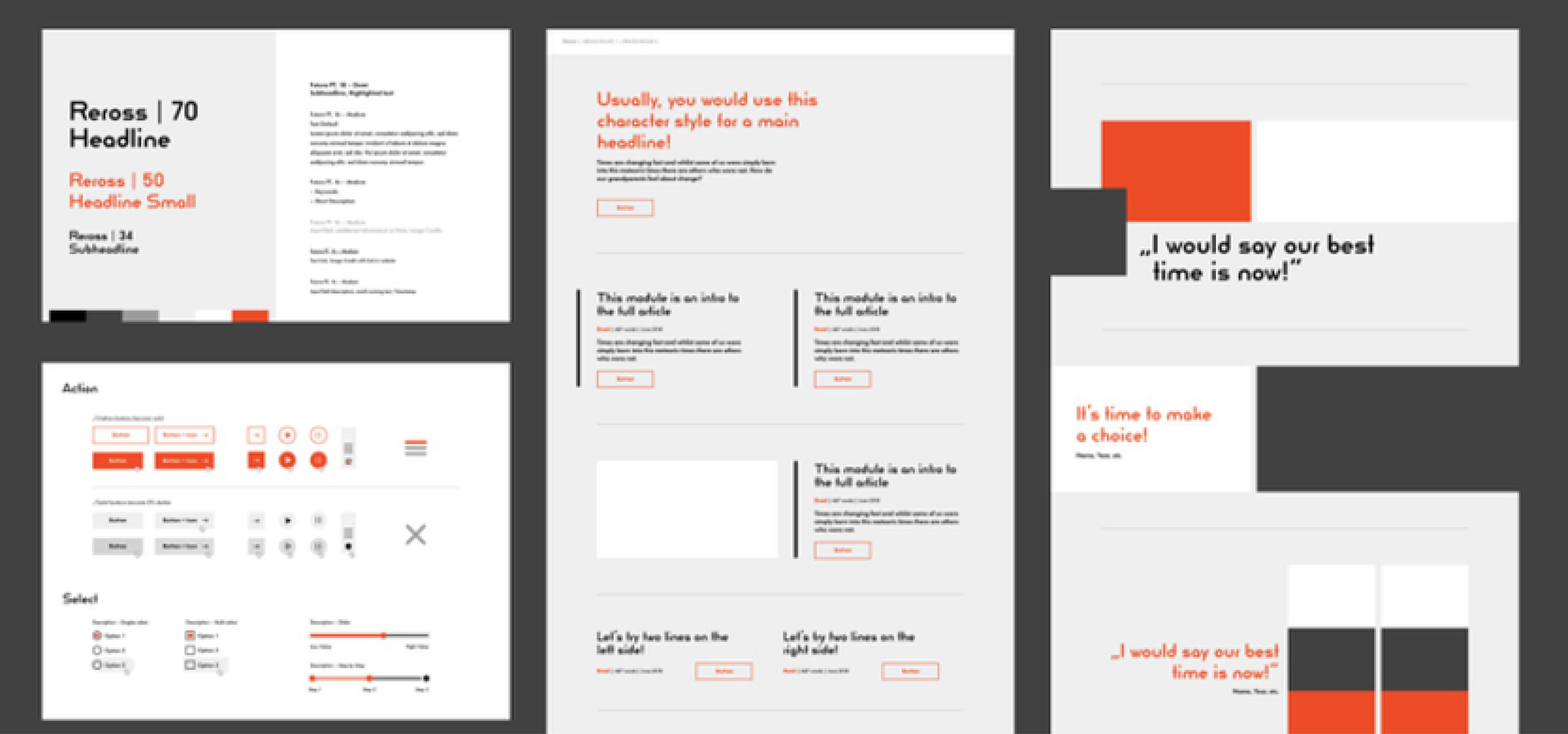
Bauhaus artists explored photography, collage, and typography, applying their wisdom in color science, font psychology, and, most importantly, graphic design layouts. The art style integrates aesthetics of various design principles, be it architecture, graphics, UX/UI design, or more.
In fact, by asserting the importance of function over form, the Bauhaus School laid the groundwork for user-centered or user experience (UX) design. It’s one of the reasons why responsive websites change their size, appearance and functionality according to the device and the user. The creative approach has become a foundation for multiple design fields to the extent that these principles are applied by modern designers without them even realizing it.
Key features of Bauhaus include-
Minimal ornamentalism
Big shapes
Clean lines
Geometrical forms
Simplicity
The approach of forms following functions
How to use Bauhaus principles for modern design-
The extremely versatile art style is compatible with the depiction of various themes. So, whether you’re designing a food app or home decor app, you can add the vintage touch of Bauhaus to create dramatic designs. Implementing elements such as simple geometric shapes, limited color palettes, bright accents, grids, accentuating fonts, collages & cut-outs can help bring an edgy feel to your design.
We can notice the implementation of the famous art movement in the works of Melanie Daveid, a Berlin-based UX designer applying Bauhaus elements and principles to 21st-century product design.
Art Deco
For the Art Deco movement, The V & A museum commented that “It drew on tradition and yet simultaneously celebrated the mechanized, modern world,” Although it somewhat reflected the grace of Art Nouveau, it also openly overstated geometric shape, colors, and ornate decorations. The art style celebrated industrialization and innovations to such an extent that some referred to it as the near–fetishization of the machine. It is from industrialization aesthetics that Art Deco gained its iconic sleek geometry.
Key features of the Art Deco movement include-
Cube forms
Smooth and polished linings
Rich colors
Luxury
Exotic effects
How to use Art Deco principles for modern design-
Contemporarily, the structure of web design relies greatly on this union of form and decoration, being most dominant in the advanced web designs. UX designers can implement Art Deco elements through experimentation with parallax design using depth, image layering and a bold color palette. The key elements usually focus on elegant color combinations, Serif fonts, gold, silver, and bronze colors, the juxtaposition of bold but sleek lines, and the integration of exotic patterns. As it’s all about luxury and glamour, designers can apply the features to display stature and style while creating websites or apps for luxury hotels, elite restaurants, jewelry showrooms, etc.
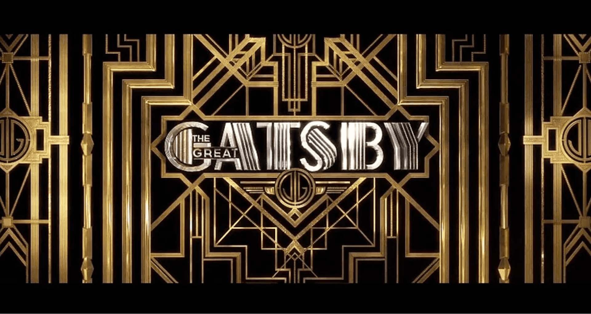
We can see the web design for the site of Los Angeles Football Club, a U.S. pro soccer franchise infused with notable references to Art Deco, partly because of its crest and site logo and in its colors. Similar features of the Art Deco style can be clearly seen in the poster of the famous movie The Great Gatsby, depicting the grandeur and luxury presented in the film.
Cubism
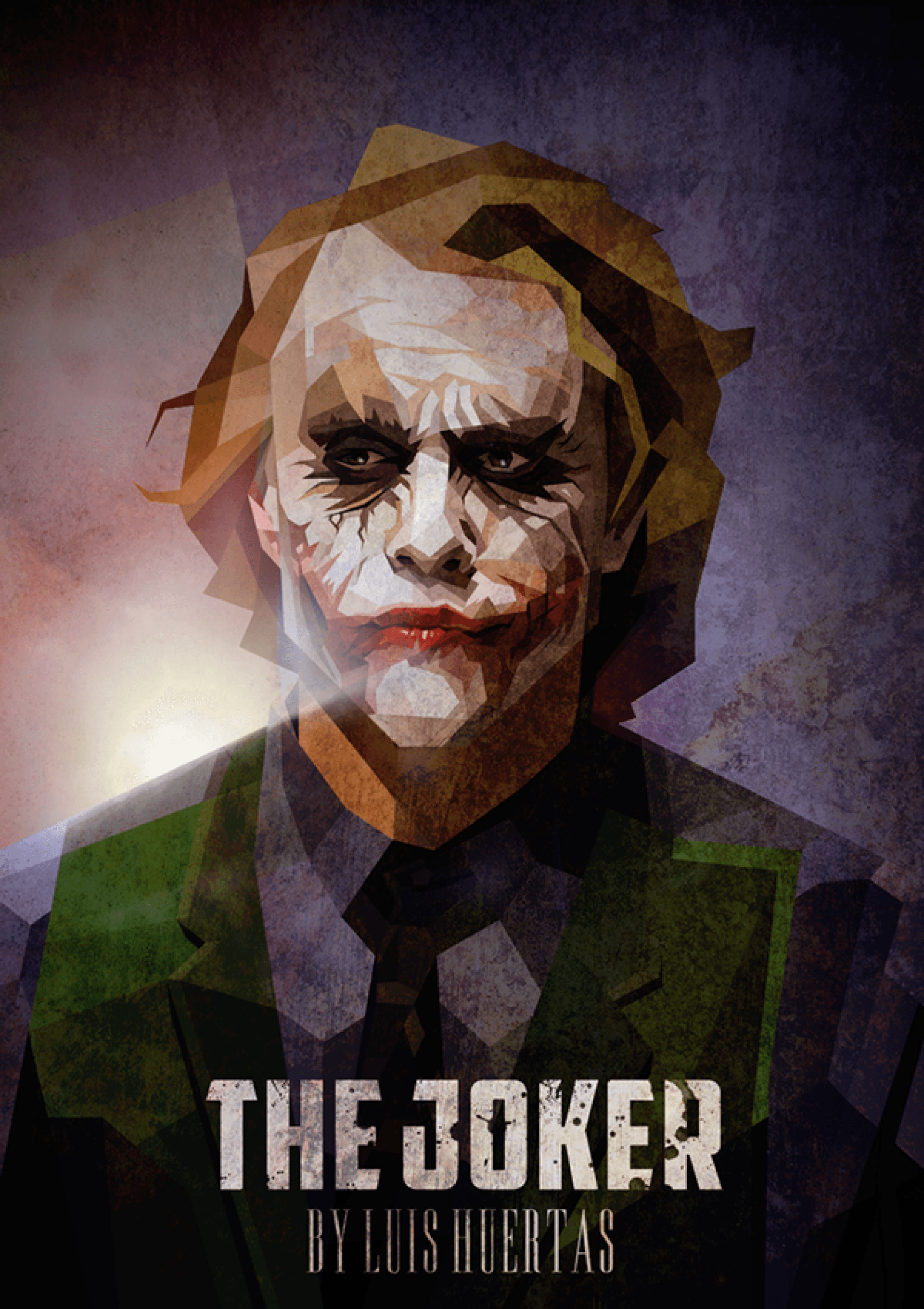
Cubism offers a unity of shape that distinguishes itself as a design technique that presents clean lines and the ability to be dismantled and rebuilt to create the right aesthetics. It rejected the traditional pursuit of the art of creating a facsimile of nature and instead stressed the two-dimensionality of the picture plane. This led to the rise of layering and sequential techniques that can be prevalently seen in web design today. The art style has become much more necessary for designers to build web templates and wireframes from scratch.
Key features of Cubism include-
Overlaying of objects
Multiple perspectives
Hard geometric forms
Exaggerated or stylized features
Flat or monochromatic color
How to use Cubism principles for modern design-
Cubism has left a lasting legacy on the art world as it welcomed abstraction and ushered it into the era of modern art. From illustration to architecture, the aesthetic of the style- flat or monochrome color, hard angles, geometric forms and fractured perspectives, appears in almost every area of the design world. As frequently seen in multiple graphics such as logos, posters and media illustrations, UX designers can apply flattened, hard-edged and overlapping features to interfaces to create a modern, vivid look.
Cubism is symbolic of “classical modernism,” making it look both retro and modern. Its look is bold and eye-catching, both dimensional and flat. The geometric composition common in Cubism is compatible even with the re-creation in design programs such as Adobe Photoshop and Illustrator. As the information on the web is present in a non-linear fashion with a simultaneous array of links and windows, the visual input with multiple angles, smooth lines, and edges are easily applied to interface designs today. Classic examples of modern-day applications of Cubism can be seen in the works like The Joker by Luis Huertas or the Geometric Beauty Poster by Peter Olexa.
Surrealism
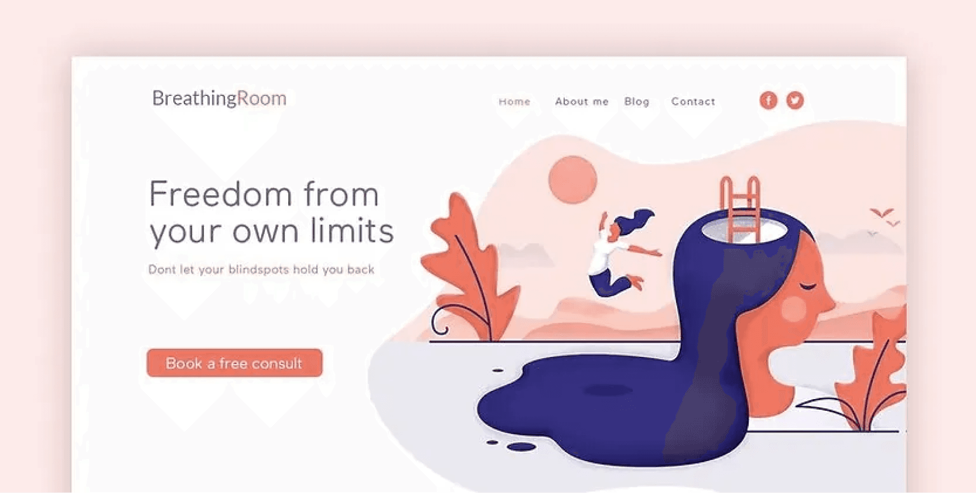
Surrealism is an avant-garde art movement involving the distinctive juxtaposition of several components within one design. Much like the collage format, Surrealism offers a technique to combine multiple naturalistic objects within a scene of disarray, resulting in an understandable and discombobulating image. Surrealist painters like Pablo Picasso used the method to create an abstract rendition of portrait paintings which many people consider as ‘humorous and ugly’ rather than a portrayal of technical skill – but the delicate preference of color and shape to produce these images is a philosophy that designers need to master to create designs that stand out.
Key features of Surrealism include-
Dream-like scenes and symbolic images
Unexpected or irrational juxtapositions
Abnormal accumulations of ordinary objects
Personal iconography
Visual puns
Distorted figures and biomorphic shapes
How to use Surrealism principles for modern design-
Surrealism is a ubiquitous design trend that is here to stay for long. Using a combination of unusual imagery, soft colors with dreamy impact, or depicting a mysterious vibe, designers can apply Surrealism to convey a message by enduring multiple disparate images and producing a combination that evokes a new understanding of a subject. For instance, using the image of a human figure and replacing the head with a lit lightbulb can depict the ignition of an idea. Similarly, you can present a storyline with novelty and transition toward a conclusion without expressing it through words.
Most Surrealist designers implement realistic, three-dimensional images that are composed and arranged instead of drawn illustrations. This creates more realistic, magical and strange visuals. Flash is also a popular tool among designers inspired by Surrealism because it can incorporate dreamy effects, animation and music, helping create surreal and interesting designs. The elements of the art style are prevalently seen in illustrations, branding, logo design, gaming, graphic design, and much more. Examples include Tony Rubino's artwork based on Son of Man by Rene Margritte, depicting Apple’s logo concept of juxtaposing an apple with a computer and Lifecoach design by Spoon Lancer.
Pop Art
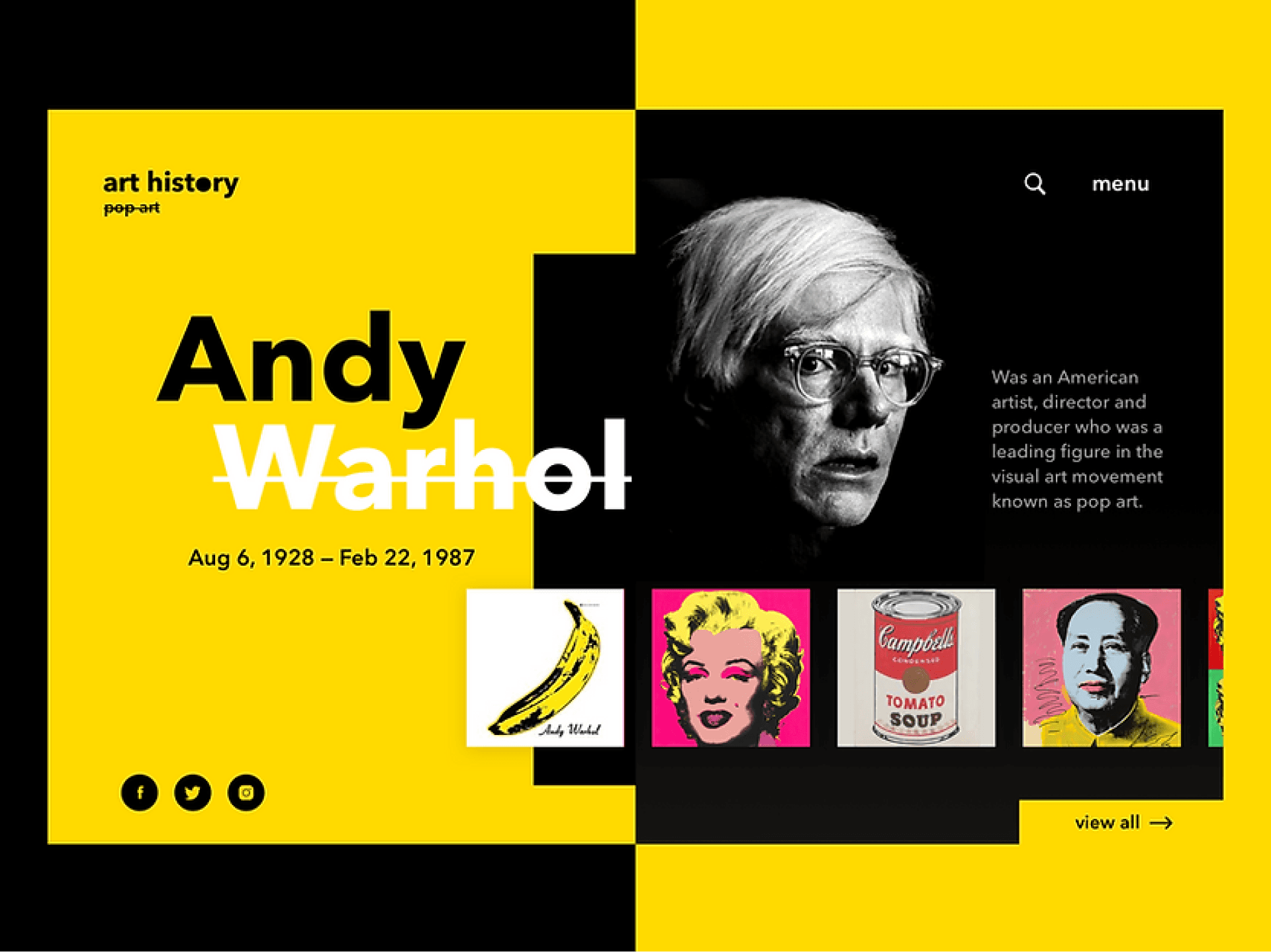
One of the most popular art styles of the 20th Century is Pop Art. Obsessively influenced by Hollywood movies, comic books and pop music, this technique is quite preferable among designers as it offers the retro aesthetics created through simple experimentation with colors and textures.
The core concept of this art movement was to create new art by drawing inspiration from mass culture. Rejecting traditional fine art, these contemporary artists openly glorified commercial culture, using ready-made images of famous people & objects and got inspired by it. For example, Andy Warhol was a fan of replicating images in several colors, and Roy Lichtenstein was fantastic at infusing emotion within his illustrated characters. These artists set a legacy for design disciplines for creating the present-day trending quirky vintage style.
Key features of Pop Art include-
Bold and neon colors
Glorifying mass culture
Sarcasm and parody
Rebellious spirit
Comic elements and characters
Psychedelic symbols and characters
How to use Pop Art principles for modern design-
With creativity and visuals representing business values, UX clients prefer strengthening customer interactions using Pop Art in digital design. The bold and distinctive Pop Art features are visible everywhere, including the web and mobile applications, games, fashion, movies, branding and advertisements, etc. The art style even fits perfectly with the popularly rising crypto and NFT art. Thus, designers have various areas to get playful with the bold colors, dramatic depictions, enlarging of objects and more. From mass media and technology to simple daily objects, designers can take inspiration for Pop Art-based designs from anywhere. Marjorie Strider’s 1963 Girl with Radish and James Francis Gill’sThree Faces of Marilyn (2014) are some popular examples of Pop Art. You can check out this cool Pop Art Website Concep
by Tanya Morenko on Dribbble to better understand and apply the distinctive Pop Art features in your design.
Conclusion
Indeed, art history is carved by the names of the most daring and revolting artists who held their ground for the creativity they believed in. As a UXer, learning the most influential design styles isn't just inspiring but thought-provoking to create something magnificent. You can be that courageous designer who widened the horizon of creativity and made their name in design history. So, don’t hold back; celebrate your uniqueness and create something glorious!
UX designers are probably familiar with various iconic art movements, including those we covered in our series of Isms of art- Tracing the Timeline of The Most Famous Movements of Art History. You must have observed how these art styles are intertwined with each other. In fact, every style movement became a basis of either a reaction or inspiration for its successive art genre. For designers, these art styles are not only the sources of inspiration but may become the foundation of their design or artwork that can leave an impression on future generations. The diverse art styles encourage your creative freedom, enabling you to experiment and discover your unique way of designing. So, without further ado, let's get some graphic boost and analyze some of the key styles that revolutionized modern design trends.
Art Nouveau

During the Art Nouveau movement, the glorification of beauty and sensuality came to force. Prominent examples include Czech graphic artist Alfons Mucha who was significantly influenced by the movement and created a beautiful art of women as goddesses surrounded by flowers and plants.
Key features of Art Nouveau include-
Ornamentalism
Smooth curvy lines
Pastel color palette
Natural motifs (plants, flowers, birds)
Sensuality
Femininity
How to use Art Nouveau principles for modern design-
The concept of sensuality ingrained in the Art Nouveau style is an excellent source of inspiration for UI and UX designers. Designers can effortlessly apply the features to products based on beauty, fragrance, cosmetics, clothing, etc., to infuse a graceful look in the interface. They can be playful with various delicate elements of the Art Nouveau style, such as pastel color palette, pattern drawing, enhancing women's beauty, fluid curvy lines, flora and fauna patterns, and much more.
In the modern design, glimpses of Art Nouveau style can be seen in the works of visual communication industry artists, for example, the painting of Marilyn Monroe for “Visages De Renom” by Les Katz, a New York-based illustrator and the Mad man poster for AMC by Milton Glaser. The exquisite use of striking use of geometric shapes, floral patterns, and pastel colors is worth taking note of.
Bauhaus

Bauhaus artists explored photography, collage, and typography, applying their wisdom in color science, font psychology, and, most importantly, graphic design layouts. The art style integrates aesthetics of various design principles, be it architecture, graphics, UX/UI design, or more.
In fact, by asserting the importance of function over form, the Bauhaus School laid the groundwork for user-centered or user experience (UX) design. It’s one of the reasons why responsive websites change their size, appearance and functionality according to the device and the user. The creative approach has become a foundation for multiple design fields to the extent that these principles are applied by modern designers without them even realizing it.
Key features of Bauhaus include-
Minimal ornamentalism
Big shapes
Clean lines
Geometrical forms
Simplicity
The approach of forms following functions
How to use Bauhaus principles for modern design-
The extremely versatile art style is compatible with the depiction of various themes. So, whether you’re designing a food app or home decor app, you can add the vintage touch of Bauhaus to create dramatic designs. Implementing elements such as simple geometric shapes, limited color palettes, bright accents, grids, accentuating fonts, collages & cut-outs can help bring an edgy feel to your design.
We can notice the implementation of the famous art movement in the works of Melanie Daveid, a Berlin-based UX designer applying Bauhaus elements and principles to 21st-century product design.
Art Deco

For the Art Deco movement, The V & A museum commented that “It drew on tradition and yet simultaneously celebrated the mechanized, modern world,” Although it somewhat reflected the grace of Art Nouveau, it also openly overstated geometric shape, colors, and ornate decorations. The art style celebrated industrialization and innovations to such an extent that some referred to it as the near–fetishization of the machine. It is from industrialization aesthetics that Art Deco gained its iconic sleek geometry.
Key features of the Art Deco movement include-
Cube forms
Smooth and polished linings
Rich colors
Luxury
Exotic effects
How to use Art Deco principles for modern design-
Contemporarily, the structure of web design relies greatly on this union of form and decoration, being most dominant in the advanced web designs. UX designers can implement Art Deco elements through experimentation with parallax design using depth, image layering and a bold color palette. The key elements usually focus on elegant color combinations, Serif fonts, gold, silver, and bronze colors, the juxtaposition of bold but sleek lines, and the integration of exotic patterns. As it’s all about luxury and glamour, designers can apply the features to display stature and style while creating websites or apps for luxury hotels, elite restaurants, jewelry showrooms, etc.
We can see the web design for the site of Los Angeles Football Club, a U.S. pro soccer franchise infused with notable references to Art Deco, partly because of its crest and site logo and in its colors. Similar features of the Art Deco style can be clearly seen in the poster of the famous movie The Great Gatsby, depicting the grandeur and luxury presented in the film.
Cubism

Cubism offers a unity of shape that distinguishes itself as a design technique that presents clean lines and the ability to be dismantled and rebuilt to create the right aesthetics. It rejected the traditional pursuit of the art of creating a facsimile of nature and instead stressed the two-dimensionality of the picture plane. This led to the rise of layering and sequential techniques that can be prevalently seen in web design today. The art style has become much more necessary for designers to build web templates and wireframes from scratch.
Key features of Cubism include-
Overlaying of objects
Multiple perspectives
Hard geometric forms
Exaggerated or stylized features
Flat or monochromatic color
How to use Cubism principles for modern design-
Cubism has left a lasting legacy on the art world as it welcomed abstraction and ushered it into the era of modern art. From illustration to architecture, the aesthetic of the style- flat or monochrome color, hard angles, geometric forms and fractured perspectives, appears in almost every area of the design world. As frequently seen in multiple graphics such as logos, posters and media illustrations, UX designers can apply flattened, hard-edged and overlapping features to interfaces to create a modern, vivid look.
Cubism is symbolic of “classical modernism,” making it look both retro and modern. Its look is bold and eye-catching, both dimensional and flat. The geometric composition common in Cubism is compatible even with the re-creation in design programs such as Adobe Photoshop and Illustrator. As the information on the web is present in a non-linear fashion with a simultaneous array of links and windows, the visual input with multiple angles, smooth lines, and edges are easily applied to interface designs today. Classic examples of modern-day applications of Cubism can be seen in the works like The Joker by Luis Huertas or the Geometric Beauty Poster by Peter Olexa.
Surrealism

Surrealism is an avant-garde art movement involving the distinctive juxtaposition of several components within one design. Much like the collage format, Surrealism offers a technique to combine multiple naturalistic objects within a scene of disarray, resulting in an understandable and discombobulating image. Surrealist painters like Pablo Picasso used the method to create an abstract rendition of portrait paintings which many people consider as ‘humorous and ugly’ rather than a portrayal of technical skill – but the delicate preference of color and shape to produce these images is a philosophy that designers need to master to create designs that stand out.
Key features of Surrealism include-
Dream-like scenes and symbolic images
Unexpected or irrational juxtapositions
Abnormal accumulations of ordinary objects
Personal iconography
Visual puns
Distorted figures and biomorphic shapes
How to use Surrealism principles for modern design-
Surrealism is a ubiquitous design trend that is here to stay for long. Using a combination of unusual imagery, soft colors with dreamy impact, or depicting a mysterious vibe, designers can apply Surrealism to convey a message by enduring multiple disparate images and producing a combination that evokes a new understanding of a subject. For instance, using the image of a human figure and replacing the head with a lit lightbulb can depict the ignition of an idea. Similarly, you can present a storyline with novelty and transition toward a conclusion without expressing it through words.
Most Surrealist designers implement realistic, three-dimensional images that are composed and arranged instead of drawn illustrations. This creates more realistic, magical and strange visuals. Flash is also a popular tool among designers inspired by Surrealism because it can incorporate dreamy effects, animation and music, helping create surreal and interesting designs. The elements of the art style are prevalently seen in illustrations, branding, logo design, gaming, graphic design, and much more. Examples include Tony Rubino's artwork based on Son of Man by Rene Margritte, depicting Apple’s logo concept of juxtaposing an apple with a computer and Lifecoach design by Spoon Lancer.
Pop Art

One of the most popular art styles of the 20th Century is Pop Art. Obsessively influenced by Hollywood movies, comic books and pop music, this technique is quite preferable among designers as it offers the retro aesthetics created through simple experimentation with colors and textures.
The core concept of this art movement was to create new art by drawing inspiration from mass culture. Rejecting traditional fine art, these contemporary artists openly glorified commercial culture, using ready-made images of famous people & objects and got inspired by it. For example, Andy Warhol was a fan of replicating images in several colors, and Roy Lichtenstein was fantastic at infusing emotion within his illustrated characters. These artists set a legacy for design disciplines for creating the present-day trending quirky vintage style.
Key features of Pop Art include-
Bold and neon colors
Glorifying mass culture
Sarcasm and parody
Rebellious spirit
Comic elements and characters
Psychedelic symbols and characters
How to use Pop Art principles for modern design-
With creativity and visuals representing business values, UX clients prefer strengthening customer interactions using Pop Art in digital design. The bold and distinctive Pop Art features are visible everywhere, including the web and mobile applications, games, fashion, movies, branding and advertisements, etc. The art style even fits perfectly with the popularly rising crypto and NFT art. Thus, designers have various areas to get playful with the bold colors, dramatic depictions, enlarging of objects and more. From mass media and technology to simple daily objects, designers can take inspiration for Pop Art-based designs from anywhere. Marjorie Strider’s 1963 Girl with Radish and James Francis Gill’sThree Faces of Marilyn (2014) are some popular examples of Pop Art. You can check out this cool Pop Art Website Concep
by Tanya Morenko on Dribbble to better understand and apply the distinctive Pop Art features in your design.
Conclusion
Indeed, art history is carved by the names of the most daring and revolting artists who held their ground for the creativity they believed in. As a UXer, learning the most influential design styles isn't just inspiring but thought-provoking to create something magnificent. You can be that courageous designer who widened the horizon of creativity and made their name in design history. So, don’t hold back; celebrate your uniqueness and create something glorious!


More Blogs
More Blogs
More Blogs

12 Aug 2024
•
5 Min ago
Testing in Design Thinking
The five stages of Design Thinking — Empathize, Define, Ideate, Prototype and Test — are not meant to be sequential steps to be taken as...
Sunny Haladker
12 Aug 2024
•
5 Min ago
10 types of prototypes
In the prototyping stage of design thinking, we try to explore the problem we have identified and ideated on. We create a sample to test...
Sunny Haladker

12 Aug 2024
•
5 Min ago
Design Thinking Phase 3 - Prototyping
Design thinking is a human centered, non linear iterative process that helps us understand our users or customers needs better, and...
Sunny Haladker


12 Aug 2024
•
5 Min ago
Testing in Design Thinking
The five stages of Design Thinking — Empathize, Define, Ideate, Prototype and Test — are not meant to be sequential steps to be taken as...
Sunny Haladker


12 Aug 2024
•
5 Min ago
10 types of prototypes
In the prototyping stage of design thinking, we try to explore the problem we have identified and ideated on. We create a sample to test...
Sunny Haladker


12 Aug 2024
•
5 Min ago
Design Thinking Phase 3 - Prototyping
Design thinking is a human centered, non linear iterative process that helps us understand our users or customers needs better, and...
Sunny Haladker


12 Aug 2024
•
5 Min ago
Testing in Design Thinking
Testing in Design Thinking
The five stages of Design Thinking — Empathize, Define, Ideate, Prototype and Test — are not meant to be sequential steps to be taken as...
Sunny Haladker


12 Aug 2024
•
5 Min ago
10 types of prototypes
10 types of prototypes
In the prototyping stage of design thinking, we try to explore the problem we have identified and ideated on. We create a sample to test...
Sunny Haladker


12 Aug 2024
•
5 Min ago
Design Thinking Phase 3 - Prototyping
Design Thinking Phase 3 - Prototyping
Design thinking is a human centered, non linear iterative process that helps us understand our users or customers needs better, and...
Sunny Haladker


12 Aug 2024
•
5 Min ago
Testing in Design Thinking
The five stages of Design Thinking — Empathize, Define, Ideate, Prototype and Test — are not meant to be sequential steps to be taken as...
Sunny Haladker


12 Aug 2024
•
5 Min ago
10 types of prototypes
In the prototyping stage of design thinking, we try to explore the problem we have identified and ideated on. We create a sample to test...
Sunny Haladker


12 Aug 2024
•
5 Min ago
Design Thinking Phase 3 - Prototyping
Design thinking is a human centered, non linear iterative process that helps us understand our users or customers needs better, and...
Sunny Haladker
More Blogs


12 Aug 2024
•
5 Min ago
Testing in Design Thinking
The five stages of Design Thinking — Empathize, Define, Ideate, Prototype and Test — are not meant to be sequential steps to be taken as...
Sunny Haladker


12 Aug 2024
•
5 Min ago
10 types of prototypes
In the prototyping stage of design thinking, we try to explore the problem we have identified and ideated on. We create a sample to test...
Sunny Haladker


12 Aug 2024
•
5 Min ago
Design Thinking Phase 3 - Prototyping
Design thinking is a human centered, non linear iterative process that helps us understand our users or customers needs better, and...
Sunny Haladker